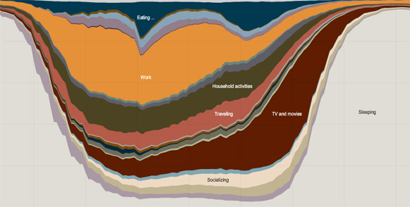
Infographic: How Americans spend their day
Mmm… infographics… There’s an interesting interactive one over at the New York Times which depicts how people over age 15 spent their time in 2008. I do wish they’d used livelier colours though. (via Kottke)


steve August 5th, 2009 4:55 pm
I blame dependency kuler for the dull colours :) http://kuler.adobe.com