find us on:
twitter
facebook
trevor may

Archive for the ‘Design’ Category

The art of the WALL·E end title sequence

WALL-E end titles

The Art of the Title Sequence interview end title sequence director Jim Capobianco and animator Alexander Woo about the end titles to Disney·Pixar’s WALL·E.

Jim Capobianco’s end credits to Andrew Stanton’s “WALL·E” are essential; they are the actual ending of the film, a perfect and fantastically optimistic conclusion to a grand, if imperfect idea. Humanity’s past and future evolution viewed through unspooling schools of art. Frame after frame sinks in as you smile self-consciously. It isn’t supposed to be this good but there it is. This is art in its own right. Peter Gabriel and Thomas Newman’s song, “Down to Earth” indulges you with some incredibly thoughtful lyrics and, from the Stone Age to the Impressionists to the wonderful 8-bit pixel sprites, you are in the midst of something special.

Coming soon: Antikewl Daily 2.0

New Antikewl Daily Mockup

If you have noticed that things have been rather slow around here again it is because I am struggling to do two things at once: build a new Antikewl Daily whilst keeping this old one populated with fresh content.

Yes, you did hear me correctly; this site is getting its very first design! Since becoming a blog in 2003, antikewl.com has worn numerous off-the-shelf themes on both MovableType and WordPress before settling on an increasingly cobbled hack of the PlainTxtBlog theme in 2006, now it is just too big (and wobbly) for its boots.

You might have noticed a few extra features that I have added already like the ability to subscribe to comment replies, links to related posts on every article and short urls… but these are just the beginning!

Keep your eyes peeled for the new Antikewl Daily soon but, in the mean time, I apologise for the lack up updates. Bear with me!

Also, there is a little peek at the top of the mockup of the new homepage above — what do you think?

The Art of Penguin Science Fiction

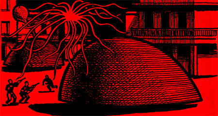
The Kraken Awakes - John Wyndham 1963 Penguin

I’ve just been browsing The Art of Penguin Science Fiction, a website “that explores the history and cover art of science fiction published by Penguin Books from 1935 to 1977.” I’ve always been a big fan of classic Penguin paperback books covers and this tied neatly to yesterday’s post on man’s vision of the future through the years.

The cropped image above is from the 1963 paperback of John Wyndham’s The Kraken Wakes. It was scanned by Michael Bojkowski — he has a few more higher resolution scans of classic paperbacks on Flickr. If you’re into Penguin covers be sure to browse Penguin Paperback Spotters’ Guild Flickr pool too.

(discovered via Noisy Decent Graphics)

Video Game Level Design Learned from Disneyland

what_would_walt_do

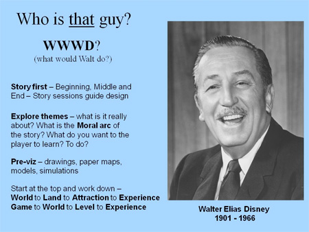
Yes, yes, yes! A belief I’ve maintained for many years — that Disneyland is an experience designer’s wet dream — has been confirmed! I’m so glad to see that THQ’s Creative Manager Scott Rogers shares my understanding. Scott worked on games including Pac-man World, God of War and Drawn to Life.

Thankfully Cory Doctorow took notes from Scott’s presentation at GDC today and made them along with photos of the slides available for all. Scott states on his blog that he’ll make his slides available shortly.

Update: The slides are now up.

This has just brought to mind the piece Cory wrote for Wired back in 2006 interviewing former Disneyland Imagineer Danny Hillis about Disneyland as an alternate world, a precursor to today’s massively multiplayer games. It all gets me wondering whether anyone else has written about or has been inspired by this topic… Some investigation awaits!

(via Boing Boing)

Rubitone: Rubik’s Cube + Pantone

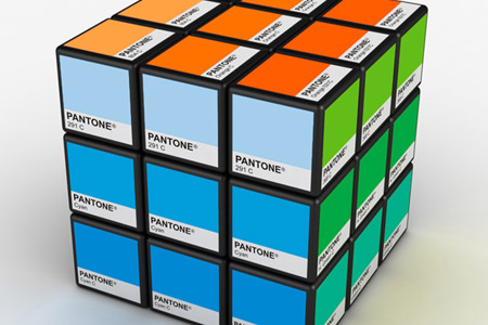
Rubitone Pantone Rubik's Cube

Design geeks! Check out this wonderful Pantone Rubik’s Cube concept by Italian industrial designer Ignacio Pilotto.

I also particularly like his Race Clock and ice bucket that turns into a watering can once the ice has melted!

dConstruct07

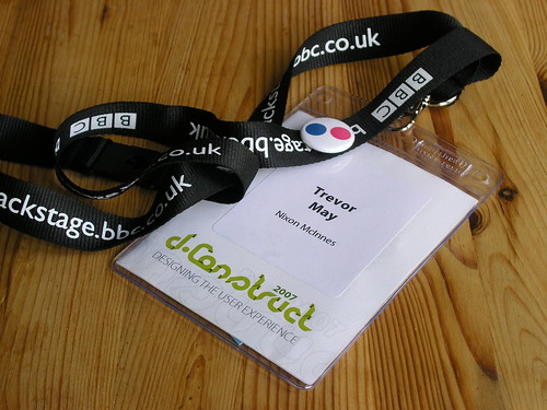
dConstruct pass

dConstruct is all over for another year.

Highlights for me were the insanely personable Tom Coates and his talk, “Designing for a Web of Data” and Cameron Moll on “Good vs Great Design“. No real lowlights, other than that I wished Denise Wilton and George Oates had a bit of a Q&A at the end of their talk… actually, a bit more Q&A all round would have been nice. Oh, and free coffee during the day would have been cool too.

What I really enjoyed, though, was meeting (meatspace social networking?) a lot of lovely like-minded folk. What’s even better is I’ve come out feeling incredibly invigorated and excited about what I do for a living — which really is a superb and unexpected bonus!

And the beer was nice too.

Actually, I have another low: Because I’m feeling more excited I’m up at eleven thirty on a Sunday finishing off a draft for an antikewl redesign — when I really should be in bed!

Boing Boing redesign

In the unlikely event that you’ve read this article before reading Boing Boing this morning, head on over there now and check out their gorgeous new redesign. The new simplified appearance was created by my friend Jemma at Sans Nom and it now has a sister blog, Boing Boing Gadgets. Enjoy, but please come back! :)

SoftBank Pantone cellphone

SoftBank Pantone mobile phone: A perfect gift for the design geek. (via NOTCOT)

A month in the life of a graphic designer

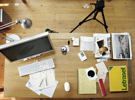
desk-small

Through June, Creative Review are following the daily life of a graphic designer.

Michael Place, from London agency Build, “has agreed to record everything that he does during this period. Every piece of work. Every idea. Every presentation. Every meeting.”

“You’ll thrill as he meets his bank manager. Gasp as he checks some proofs. Marvel as he tours exotic locations such as Walthamstow and Epping Forest. All will be revealed.”

Munich 1972 = Good, London 2012 = Bad

Munich 1972

After forgetting about the new London 2012 Olympics logo for a week I stumbled upon this post at Design Observer. I did love that Sun headline. Anyway, to try to forget this “cool” new rave identity (at least until it gets plastered over every billboard in town) I decided to do a little search for one of my favourite Olympics identities of the past: Otl Aicher‘s work for Munich 1972.

Here’s what I found:

72 Exhibition
1972 Munich Design Report Flickr set
1972 Munich Olympics Flickr set
Otl Aitcher and the Munich Olympiad Flickr set
Otl Aicher: Utilitarian Design