find us on:
twitter
facebook
trevor may

Archive for the ‘Typography’ Category

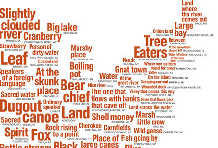
National Geographic Native American Place Names Map

native_american_town_names

National Geographic Magazine: What’s in an American Name?

Native American words echo in the names of lakes, rivers, mountains, states, cities, and small towns across the United States. The first settlers, who put many European words on the map, also borrowed names from local tribes. They often mispronounced what they heard—that’s how the Washoe word dá’aw, or lake, became Tahoe.

(via Aegir)

Munich 1972 = Good, London 2012 = Bad

Munich 1972

After forgetting about the new London 2012 Olympics logo for a week I stumbled upon this post at Design Observer. I did love that Sun headline. Anyway, to try to forget this “cool” new rave identity (at least until it gets plastered over every billboard in town) I decided to do a little search for one of my favourite Olympics identities of the past: Otl Aicher‘s work for Munich 1972.

Here’s what I found:

72 Exhibition
1972 Munich Design Report Flickr set
1972 Munich Olympics Flickr set
Otl Aitcher and the Munich Olympiad Flickr set
Otl Aicher: Utilitarian Design

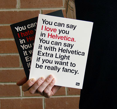
The Helvetica Notebook

Helvetica notebook

The typographic geek inside me finds this two-sided notebook from Veer incredibly amusing. Featuring quotes from Helvetica, the documentary film by Gary Hustwit, in 3pt type it’s available direct for $22 if you’re in the US. If you’re outside the US I’m afraid you’re out of luck. (via swissmiss)